

Pastel bricks add a soft, dreamy touch to any artwork. Whether you are working on a coloring book page, a personal art project, or practicing new coloring techniques, knowing how to blend pastel colors effectively is key to achieving a realistic pastel brick effect.
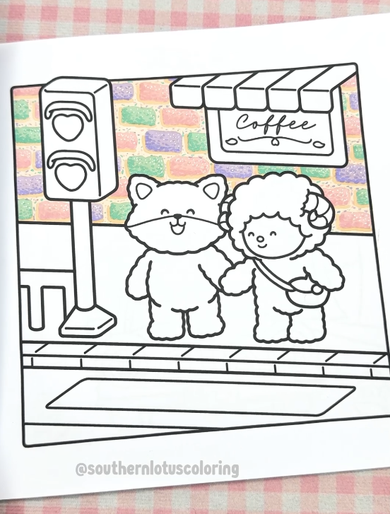
In today’s tutorial, using a page from "Fuzzy In Love" by Southern Lotus Coloring Book, we'll explore a step-by-step process to color pastel bricks with markers. Follow along to learn blending techniques, shadowing tips, and how to highlight your bricks for a soft, elegant finish.
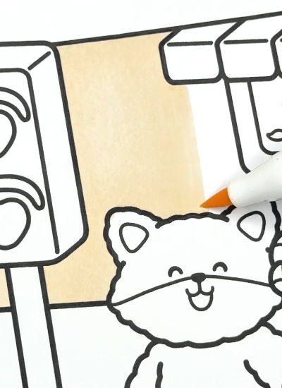
Start by applying a soft base layer using R18. This foundation color helps the pastel shades blend smoothly and gives a uniform look to your bricks.
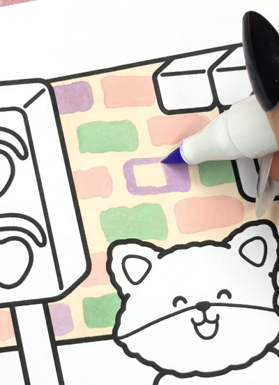
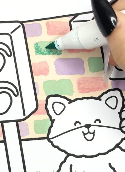
For a dreamy pastel brick effect, alternate between RV260, G420, and V230 when coloring each brick. Use light, even strokes to ensure smooth blending and avoid repeating the same color next to each other to create contrast.
Shadows help create a realistic brick texture.
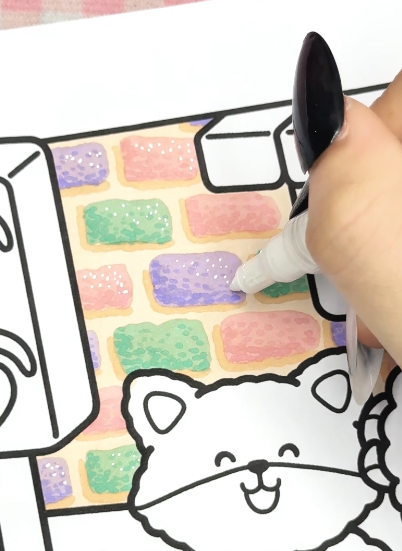
Tip: The dotting technique enhances color texture and gives a 3D effect.
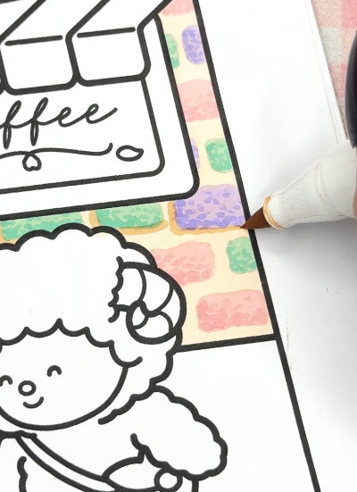
To enhance the realism, add outer shadows using E090. Draw a thin line along the bottom and outside of the bricks, and blend slightly for a natural shading transition.
For the final glowy effect, add highlights with a white acrylic pen. The highlights will be on the opposite side of the shadows for balance, and you can use small strokes and dots to mimic light reflections on the bricks.
By following this tutorial, you’ve created pastel-colored bricks with soft shadows and highlights. The combination of blended colors, strategic shadowing, and crisp highlights gives your illustration a realistic, dreamy effect.
Try this technique on different pages and watch your pastel brick artwork come to life!
Enter your email to get our special. Gift straight to your inbox.